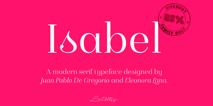
What is the Isabel font?
Isabel was made out of necessity to create a new font for children and teenagers, that could be enough friendly and versatile for text in words or even easy-to- read long texts.
The purpose of Isabel is to combine all the nice and friendly features of the simple letters that the teachers teach to the pupils at primary school, as they starting to learn to read, together with the normal editorial fonts we read every day. In this way it generates a very joyful serif font, or even friendly font, with some conservative aspects. In other words, Isabel is a font that, despite of being a “classic features” typography, is proud to show its innocent and ingenuous elements, this gives to the font a new point of view. More…
The family is composed of 3 parts: the regular version, the italic version and the unicase version.
Each one of them has 5 weights, 551 characters and is composed of 208 languages.
Isabel Font families
The Isabel includes the following font families:
- Isabel Thin
- Isabel Thin Italic
- Isabel Unicase Thin
- Isabel Light
- Isabel Light Italic
- Isabel Unicase Light
- Isabel Regular
- Isabel Italic
- Isabel Unicase Regular
- Isabel Bold
- Isabel Bold Italic
- Isabel Unicase Bold
- Isabel Black
- Isabel Black Italic
- Isabel Unicase Black
Isabel Preview
Here is a preview of how Isabel will look. For more previews using your own text as an example, click here.