What is the Futura® font?
First presented by the Bauer Type Foundry in 1928, Futura is commonly considered the major typeface development to come out of the Constructivist orientation of the Bauhaus movement in Germany.
Paul Renner (type designer, painter, author and teacher) sketched the original drawings and based them loosely on the simple forms of circle, triangle and square. The design office at Bauer assisted him in turning these geometric forms into a sturdy, functioning type family, and over time, Renner made changes to make the Futura fonts even more legible. More…
Futura’s long ascenders and descenders benefit from generous line spacing. The range of weights and styles make it a versatile family. Futura is timelessly modern; in 1928 it was striking, tasteful, radical — and today it continues to be a popular typographic choice to express strength, elegance, and conceptual clarity.
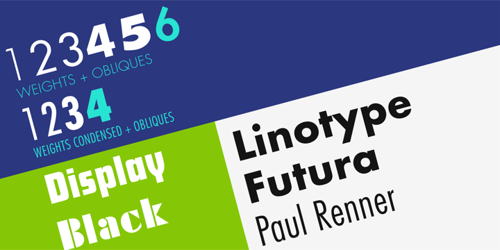
Futura® Font families
The Futura® includes the following font families:
- Futura Light
- Futura Light Oblique
- Futura Book
- Futura Book Oblique
- Futura Medium
- Futura Medium Oblique
- Futura Bold
- Futura Bold Oblique
- Futura Heavy
- Futura Heavy Oblique
- Futura Extra Bold
- Futura Extra Bold Oblique
- Futura Light Condensed
- Futura Light Condensed Oblique
- Futura Medium Condensed
- Futura Medium Condensed Oblique
- Futura Bold Condensed
- Futura Bold Condensed Oblique
- Futura Extra Bold Condensed
- Futura Extra Bold Condensed Oblique
- Futura Display
- Futura Black
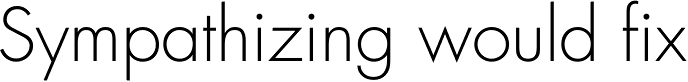
Futura® Preview
Here is a preview of how Futura® will look. For more previews using your own text as an example, click here.