What is the Bree Serif font?
In 2008 TypeTogether released the Bree typeface, a sleek sans serif that quickly became a favorite among brand and editorial designers.
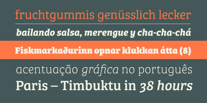
Bree Serif follows the same theme as its predecessor. It is a young and energetic upright italic that approaches readers with hip and somewhat elegant charm. It has a range of styles that can perform as counterparts to the original Bree fonts. At the same time though they bring a whole range of new and individual features that make Bree Serif a separate type family in its own right. More…
The characters in Bree Serif maintain the original flavour of handwriting, but have a more subtle appearance to support optimal editorial usage. The slabby nature of its shapes, particularly in the heavier weights, makes for a strong impression.
Some of the characteristic features of its sans serif cousin are present in Bree Serif too, such as the single-story ‘a’, the cursive ‘e’ and the rhythmical ‘k’ and ‘y’. Alternate letters of these are also available when a more neutral look is desired.
Bree Serif offers a mixture of fluid and attractive forms that convey a contemporary and vivid aspect. If you loved the multi- award winning Bree, you will surely love its seriffed cousin!
Bree Serif Font families
The Bree Serif includes the following font families:
- Bree Serif Thin
- Bree Serif Thin Italic
- Bree Serif Light
- Bree Serif Light Italic
- Bree Serif
- Bree Serif Italic
- Bree Serif SemiBold
- Bree Serif SemiBold Italic
- Bree Serif Bold
- Bree Serif Bold Italic
- Bree Serif ExtraBold
- Bree Serif ExtraBold Italic
Bree Serif Preview
Here is a preview of how Bree Serif will look. For more previews using your own text as an example, click here.
