What is the Garamond Simoncini SB® font?
Since the release of these fonts most typefaces in the Scangraphic Type Collection appear in two versions. One is designed specifically for headline typesetting (SH: Scangraphic Headline Types) and one specifically for text typesetting (SB Scangraphic Bodytypes). The most obvious differentiation can be found in the spacing. That of the Bodytypes is adjusted for readability. That of the Headline Types is decidedly more narrow in order to do justice to the requirements of headline typesetting. The kerning tables, as well, have been individualized for each of these type varieties. In addition to the adjustment of spacing, there are also adjustments in the design. For the Bodytypes, fine spaces were created which prevented the smear effect on acute angles in small typesizes. For a number of Bodytypes, hairlines and serifs were thickened or the whole typeface was adjusted to meet the optical requirements for setting type in small sizes. For the German lower-case diacritical marks, all Headline Types complements contain alternative integrated accents which allow the compact setting of lower-case headlines.
Garamond Simoncini SB® Font families
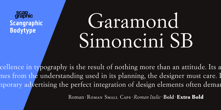
The Garamond Simoncini SB® includes the following font families:
- Garam Simon SB Roman
- Garam Simon SB Italic
- Garam Simon SB Roman OsF
- Garam Simon SB Roman SC
- Garam Simon SB Bold
- Garam Simon SB Extra Bold
Garamond Simoncini SB® Preview
Here is a preview of how Garamond Simoncini SB® will look. For more previews using your own text as an example, click here.
