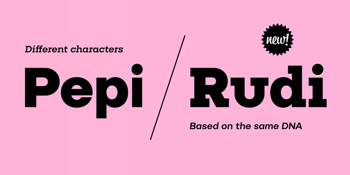
What is the Pepi/Rudi font?
The superfamily Pepi and Rudi is based on playful experimentation with basic geometric shapes – the circle, rectangle and triangle – elements that laid the foundations for typographic Modernism. The Pepi and Rudi introduces a number of current elements into a time-proven concept of primitively constructed typefaces. The typeface’s somewhat uniform character width establishes a more regular rhythm; the character set is expanded, and legibility is improved thanks to taller lowercase. A wide range of ten styles, from hairline-thin to extra-thick with adequate Italics allow for universal use across the whole scope of graphic design. Carefully designed diacritics, clear punctuation marks, table number characters, ligatures, arrows or alternative lowercase characters are standard; this is sure to please everyone needing to work effectively with a neutral, geometric headline typeface.
Pepi/Rudi Font families
The Pepi/Rudi includes the following font families:
- Pepi Hair
- Pepi Hair Italic
- Pepi Thin
- Pepi Thin Italic
- Pepi Light
- Pepi Light Italic
- Pepi Regular
- Pepi Regular Italic
- Pepi Medium
- Pepi Medium Italic
- Pepi Semi Bold
- Pepi Semi Bold Italic
- Pepi Bold
- Pepi Bold Italic
- Pepi Heavy
- Pepi Heavy Italic
- Pepi Black
- Pepi Black Italic
- Pepi Ultra
- Pepi Ultra Italic
- Rudi Hair
- Rudi Hair Italic
- Rudi Thin
- Rudi Thin Italic
- Rudi Light
- Rudi Light Italic
- Rudi Regular
- Rudi Regular Italic
- Rudi Medium
- Rudi Medium Italic
- Rudi Semi Bold
- Rudi Semi Bold Italic
- Rudi Bold
- Rudi Bold Italic
- Rudi Heavy
- Rudi Heavy Italic
- Rudi Black
- Rudi Black Italic
- Rudi Ultra
- Rudi Ultra Italic
Pepi/Rudi Preview
Here is a preview of how Pepi/Rudi will look. For more previews using your own text as an example, click here.
