What is the Kamane font?
Kamane is a new font family, designed by Naghi Naghashian. It is based on classic calligraphic “Naskh” with the modern typographic metric. It is a Font family, in 3 weights, Light, Regular and Bold. This font is a contribution to modernisation of Arabic typography, gives the font design of Arabic letters real typographic arrangement und provides more typographic flexibility. Kamane supports Arabic, Persian and Urdu.
It also includes proportional and tabular numerals for the supported languages.
Kamane design fulfils the following needs: More…
A Explicitly crafted for use in electronic media fulfills the demands of electronic communication.
B Suitability for multiple applications. Gives the widest potential acceptability.
C Extreme legibility not only in small sizes, but also when the type is filtered or skewed, e.g., in Photoshop or Illustrator. Nima’s simplified forms may be artificial obliqued in InDesign or Illustrator, without any loss in quality for the effected text.
D An attractive typographic image. Kamane was developed for multiple languages and writing conventions. Kamane supports Arabic, Persian and Urdu. It also includes proportional and tabular numerals for the supported languages.
E The highest degree of calligraphic grace and the clarity of geometric typography.
Kamane Font families
The Kamane includes the following font families:
- Kamane Light
- Kamane Regular
- Kamane Bold
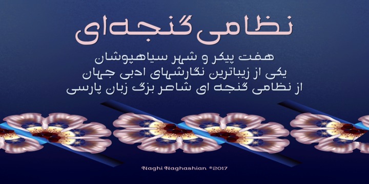
Kamane Preview
Here is a preview of how Kamane will look. For more previews using your own text as an example, click here.