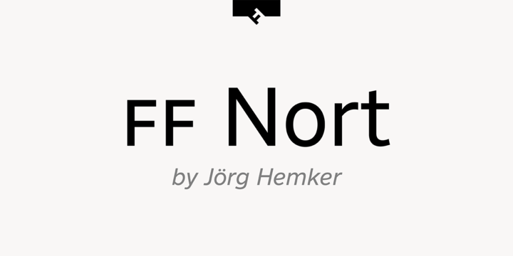
What is the FF Nort™ font?
FF Nort™ has all the design attributes that make for an exceptionally versatile print and web typeface – and it benefits from a distinct personality. Equally at home in long-form text copy or billboard size headlines, the family knows few boundaries. There is also a handcrafted neo-grotesque quality to the design, giving FF Nort a friendly mien and separating it from other industrial strength sans serif typefaces.
Terminals are clipped at 90° angles to the stroke and counters are slightly condensed, saving space with no loss of legibility. The light weights have a subtle elegance, while the bold are commanding. All eight weights, and their italic companions, enjoy a large character set, with support for most Central and several Eastern European languages – including Cyrillic and Greek. More…
Drawn by Jörg Hemker, the inspiration for FF Nort came from Transport, the typeface designed for Britain’s highway signage. Transport is formal, intellectual, and a model for modern street signage, but it was not intended for small sizes or continuous reading. Hemker took the basic structure of Transport and rebuilt it into a design that’s perfect for a wide range of contemporary hardcopy and digital imaging projects.
FF Nort™ Font families
The FF Nort™ includes the following font families:
- FF Nort Thin
- FF Nort Thin Italic
- FF Nort Extra Light
- FF Nort Extra Light Italic
- FF Nort Light
- FF Nort Light Italic
- FF Nort Regular
- FF Nort Regular Italic
- FF Nort Medium
- FF Nort Medium Italic
- FF Nort Bold
- FF Nort Bold Italic
- FF Nort Black
- FF Nort Black Italic
- FF Nort Ultra
- FF Nort Ultra Italic
FF Nort™ Preview
Here is a preview of how FF Nort™ will look. For more previews using your own text as an example, click here.
